Role: Design Lead | Platforms: iOS & Android | Team: Self Serve | Timeline: 07/2025 - 07/2025
The MyRogers mobile app is the primary self-service platform for customers of Rogers Communications, enabling them to manage their services, monitor usage, add and remove services, get support and pay bills.
As of 2025, Rogers reported approximately 12.2 million wireless subscribers, making the app a critical digital touchpoint for millions of customers.
As of 2025, Rogers reported approximately 12.2 million wireless subscribers, making the app a critical digital touchpoint for millions of customers.
The problem
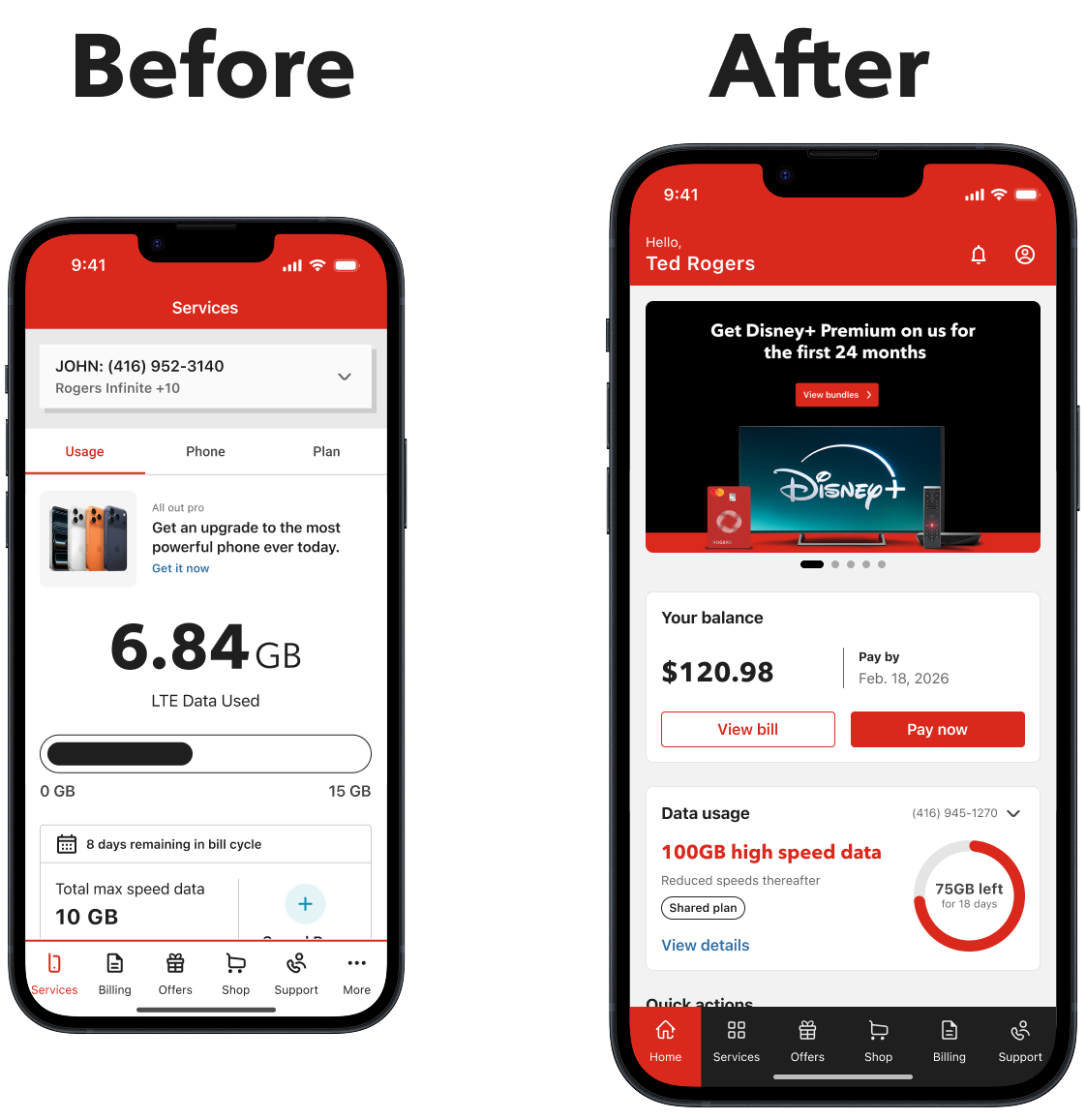
Before this initiative, the MyRogers mobile app directed users straight to a data usage screen immediately after login.
While useful for tracking consumption, this experience provided limited value for customers trying to manage their accounts. Essential actions such as paying bills, managing services, upgrading devices, or accessing support were buried behind multiple navigation layers.
At the same time, the app needed to support an increasingly complex ecosystem of services including wireless, internet, TV, smart home devices, and multi-line accounts.
The existing experience was not designed to surface these services clearly or help customers take action quickly.
The existing experience was not designed to surface these services clearly or help customers take action quickly.
This created three key challenges:
Limited Actionability:
The app primarily functioned as a usage tracker rather than a service management hub.
The app primarily functioned as a usage tracker rather than a service management hub.
Poor Service Visibility:
Customers struggled to discover and manage the full range of services linked to their accounts.
Customers struggled to discover and manage the full range of services linked to their accounts.
Missed Engagement Opportunities:
Opportunities to surface relevant offers, upgrades, and bundled services were difficult to integrate into the existing structure.
Opportunities to surface relevant offers, upgrades, and bundled services were difficult to integrate into the existing structure.
The result was an entry experience that did not reflect the growing complexity of Rogers’ service ecosystem or the evolving expectations of modern mobile apps.
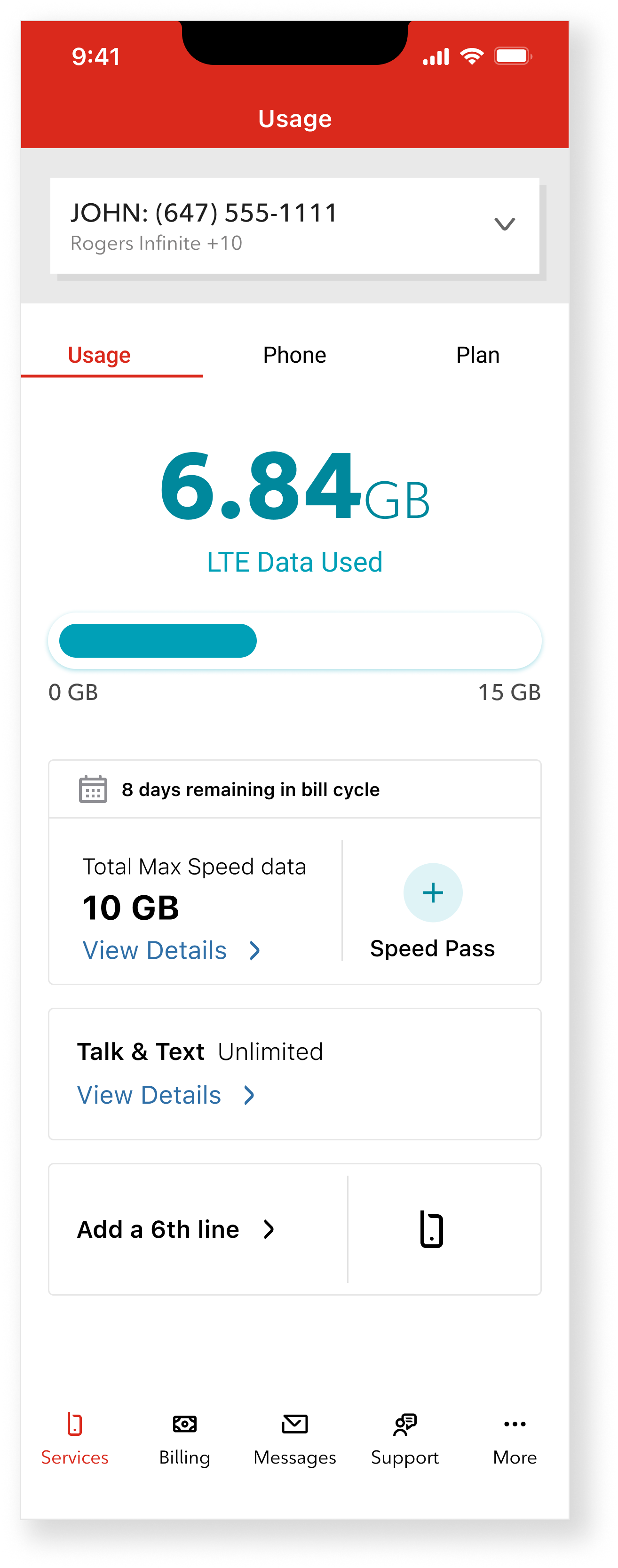
Previous MyRogers usage page focused
primarily on data usage.
The Idea
Instead of improving the existing usage page, I proposed introducing a Home experience that would transform the app into a central hub where customers could manage their services and take action quickly and enabling the business to place personalized offers right in the app.
The goal was to create a single entry point where users could:
• View billing information, make payments and manage and set-up AutoPay
• Monitor data usage across their shared lines
• Access and manage connected services, like Internet, TV, Wireless and 5G home internet
• Discover upgrades and personalized offers
• Reach support easily when needed
• Monitor data usage across their shared lines
• Access and manage connected services, like Internet, TV, Wireless and 5G home internet
• Discover upgrades and personalized offers
• Reach support easily when needed
This approach reframed the app from a usage tracking tool into a service management platform.
The concept focused on prioritizing the most common customer actions while surfacing relevant services and opportunities directly on the landing experience.
Executive Alignment
The concept was presented to leadership as an opportunity to transform the MyRogers app from a usage tracker into a service management hub.
Following internal reviews, the proposal received executive endorsement and initial funding to begin development. The initiative was approved with $1.5M investment allocated to the design team to build the new Home experience.
This step formalized the concept as part of the MyRogers roadmap.
Design principles
To guide the design of the new Home experience, I defined a set of principles that prioritized customer actions while accommodating the complexity of Rogers’ service ecosystem.
Action First:
The Home experience was designed around the most common customer tasks.
Key actions such as paying bills, checking data usage, managing services, and accessing support needed to be immediately accessible without navigating through multiple menus.
The interface prioritizes these high-frequency tasks at the top of the experience.
Service Visibility:
Many customers manage multiple services such as wireless, internet, TV, and smart home devices.
The new Home experience surfaces these services clearly, allowing users to quickly understand what is connected to their account and access the relevant management tools.
Personalization:
The Home experience adapts based on the customer’s account configuration.
Different layouts and components are displayed depending on the services linked to the account, ensuring that users see the most relevant information and actions.
Monetization Without Friction:
The design introduces opportunities for device upgrades, service bundles, and add-ons directly within the Home experience.
Rather than interrupting the user journey, these opportunities are integrated naturally alongside service management features.
Discovery and components explorations:
Discovery and components explorations:
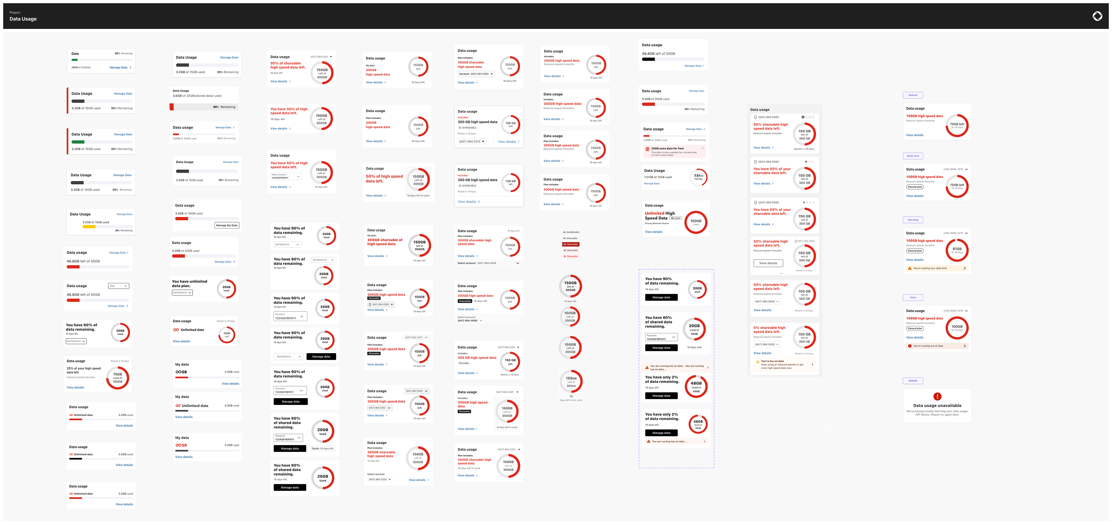
The solution
To bring the Home experience to life, I designed a modular dashboard architecture that organizes the most important customer actions and services into a single entry point.
The layout prioritizes high-frequency tasks while adapting dynamically to the services linked to each account.
The result is a flexible experience that supports a wide range of customer scenarios while keeping the interface clear and actionable.
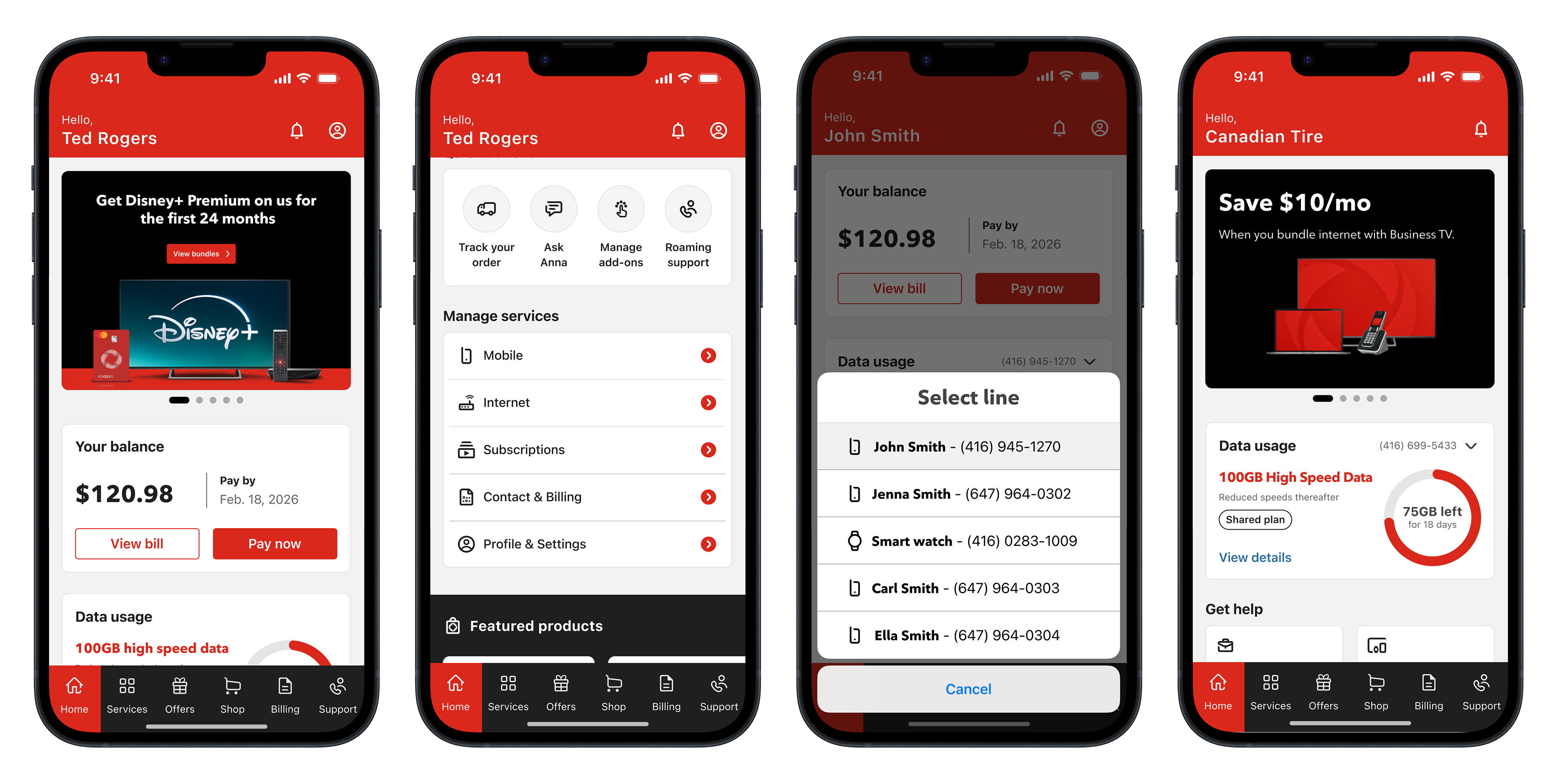
The Home Architecture
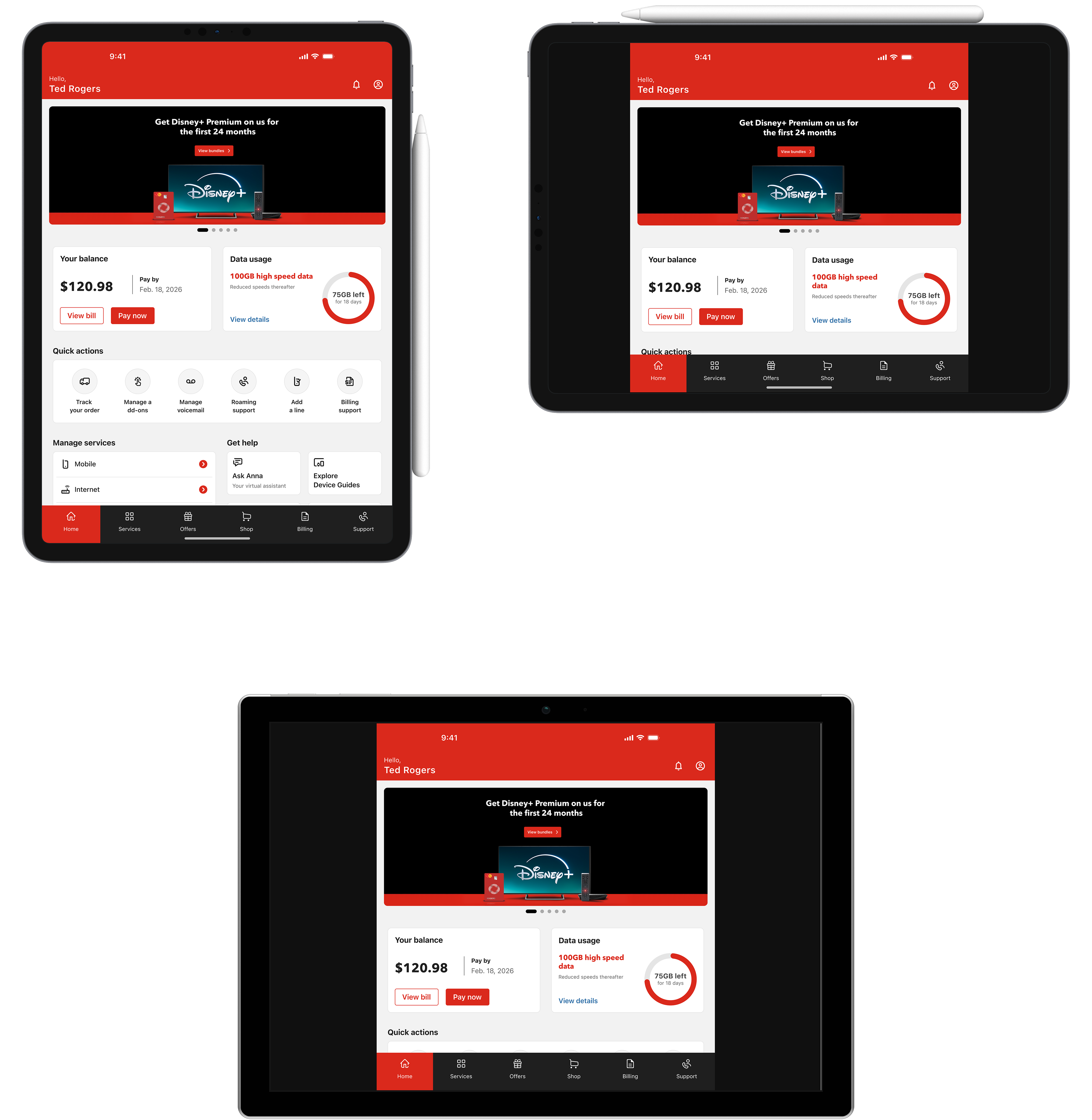
This new Home experience organizes the app around five key areas:
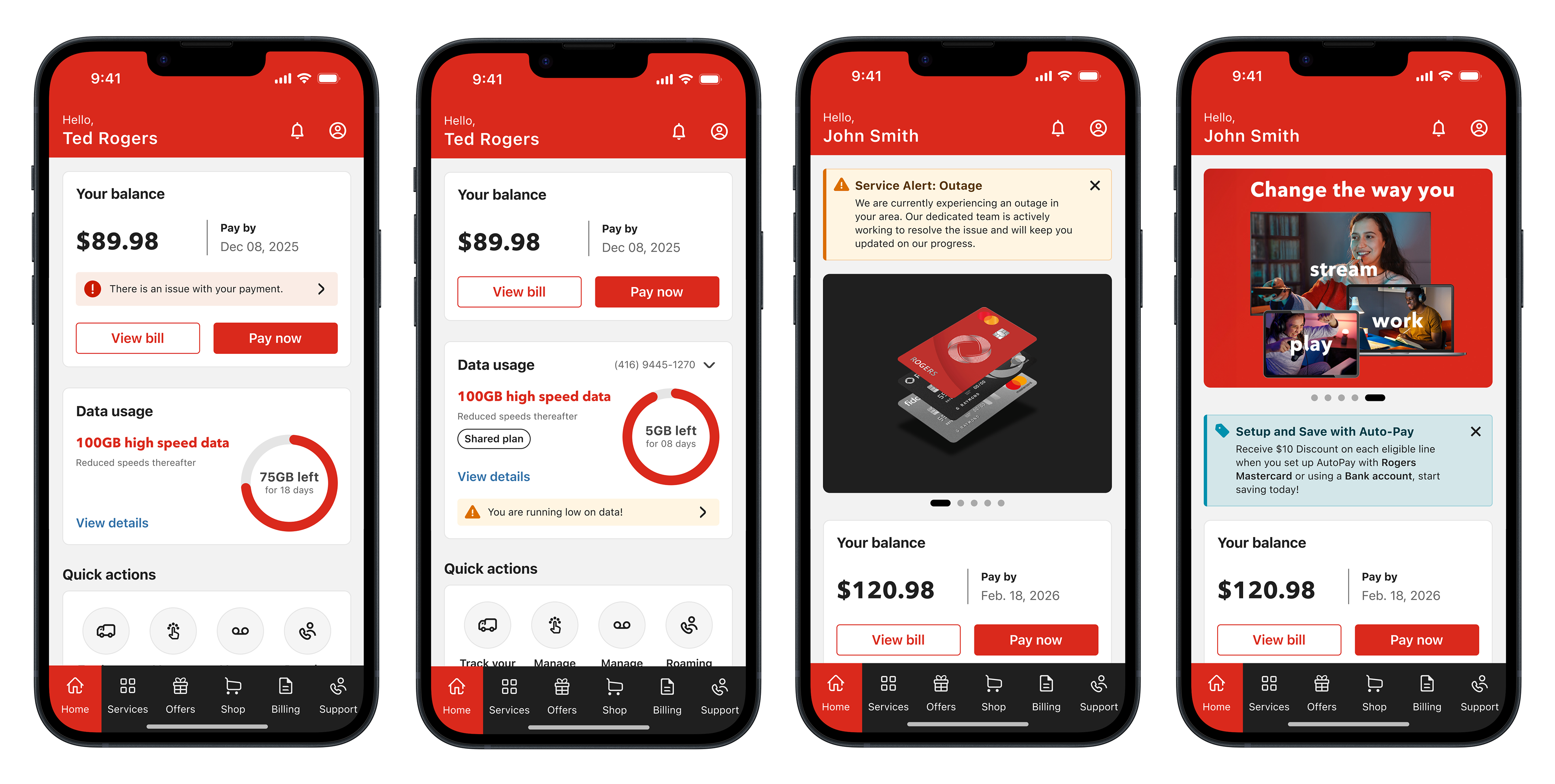
Account Overview
Customers can quickly see their billing status and account details, with direct access to actions such as viewing the bill or making a payment.
This ensures one of the most common tasks in the app is immediately accessible.
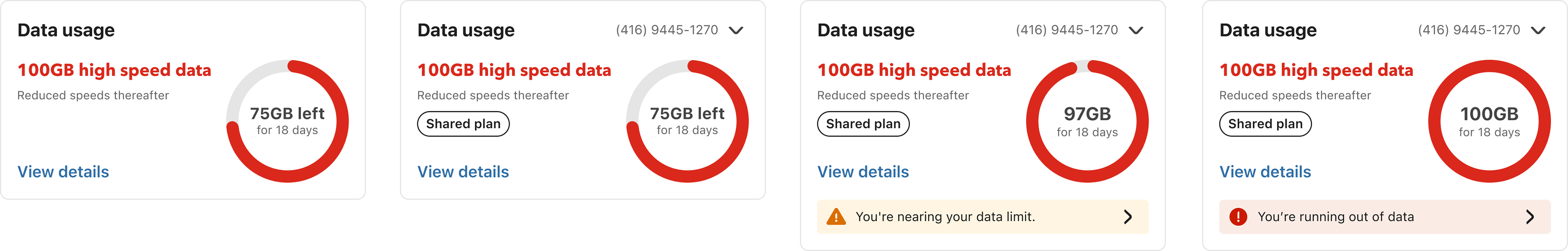
Data Usage Monitoring
A visual data indicator helps customers quickly understand how much data remains in their current billing cycle.
For multi-line accounts, the experience allows users to review usage across different phone numbers.
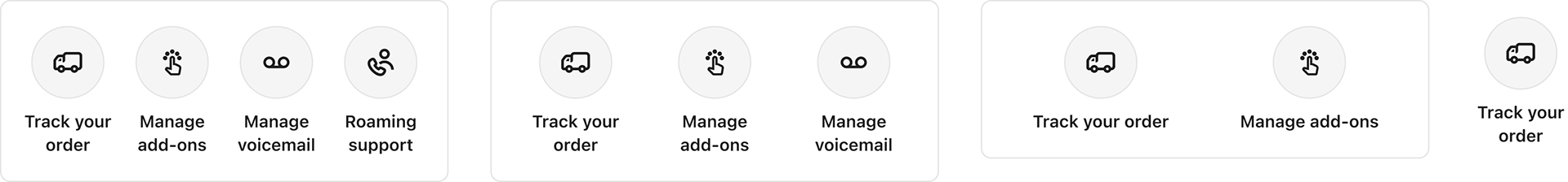
Quick Actions
Shortcuts provide fast access to common tasks such as:
• Tracking orders
• Managing subscriptions
• Adjusting account settings
• Support for Roaming and Billing
• Managing subscriptions
• Adjusting account settings
• Support for Roaming and Billing
This reduces the need to navigate through deeper menus, and will be personalized to user needs by platform.
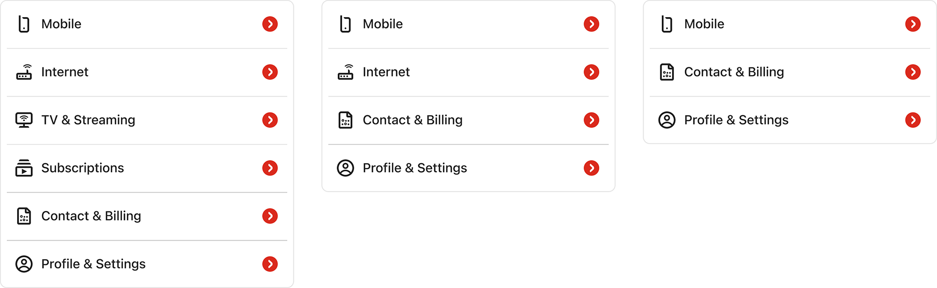
Service Management
The Home experience surfaces the services connected to the customer’s account, including:
• Wireless
• Internet
• TV
• Streaming subscriptions
• 5G Home Internet
• Home Security
• Internet
• TV
• Streaming subscriptions
• 5G Home Internet
• Home Security
This makes it easier for customers to understand and manage their services from one place.
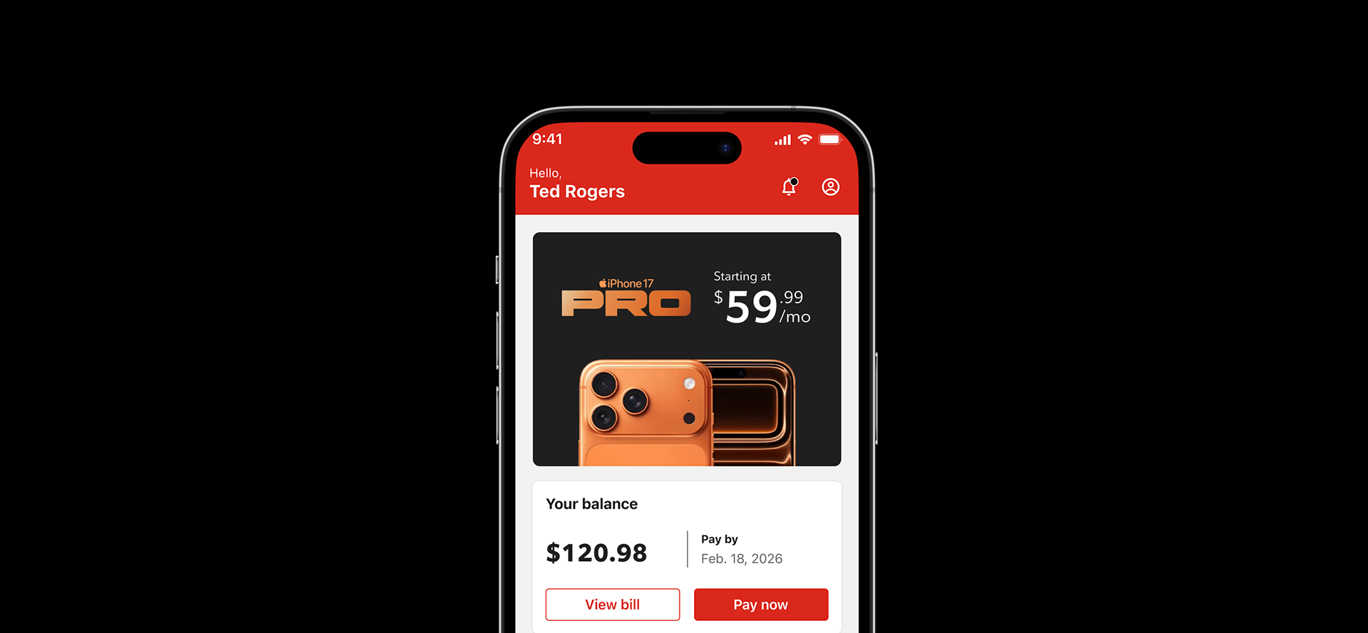
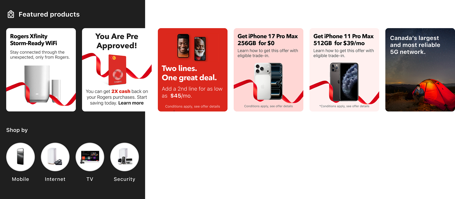
Personalized Offers
The experience introduces personalized promotional surfaces where customers can discover:
• device upgrades
• service upgrades
• bundled offers
• service upgrades
• bundled offers
These opportunities are integrated naturally within the experience without interrupting the primary tasks.
Handling Product Complexity
Designing the Home experience required supporting a wide range of account configurations and service combinations.
Unlike simpler consumer apps, telecom accounts often include multiple services, multiple users, and different permission levels, which meant the interface needed to adapt dynamically based on the customer’s account structure.
The design needed to account for several scenarios.
Multi-Line Accounts
Many customers manage family plans or business accounts with multiple phone numbers.
The experience allows users to quickly review data usage across lines and access management options for each number.
This required designing flexible components capable of displaying combined usage or individual line details.
Bundled Services
Customers may have multiple services linked to the same account, including:
• Wireless
• Home internet
• TV packages
• Streaming subscriptions
• Smart home monitoring
• Home internet
• TV packages
• Streaming subscriptions
• Smart home monitoring
The Home experience surfaces these services clearly so customers can understand and manage everything connected to their account.
Different Account Permissions
Not all users have the same level of access.
Some users may only be authorized to view usage or make payments, while others can fully manage the account and modify services.
The interface adapts to these permission levels while maintaining a consistent layout.
Data Synchronization Challenges
Service data is not always updated in real time across backend systems.
The design needed to gracefully handle scenarios such as delayed usage updates, partial data availability, or temporary service information gaps without confusing the customer.
Business account | Manage services | Multi-lines | Gov + Corp accounts
Notifications:
Billing notifications | Data usage warning | System alerts | Personalized offers
iOS & Android
Smallest device supported: iOS: 375px | Android: 360px
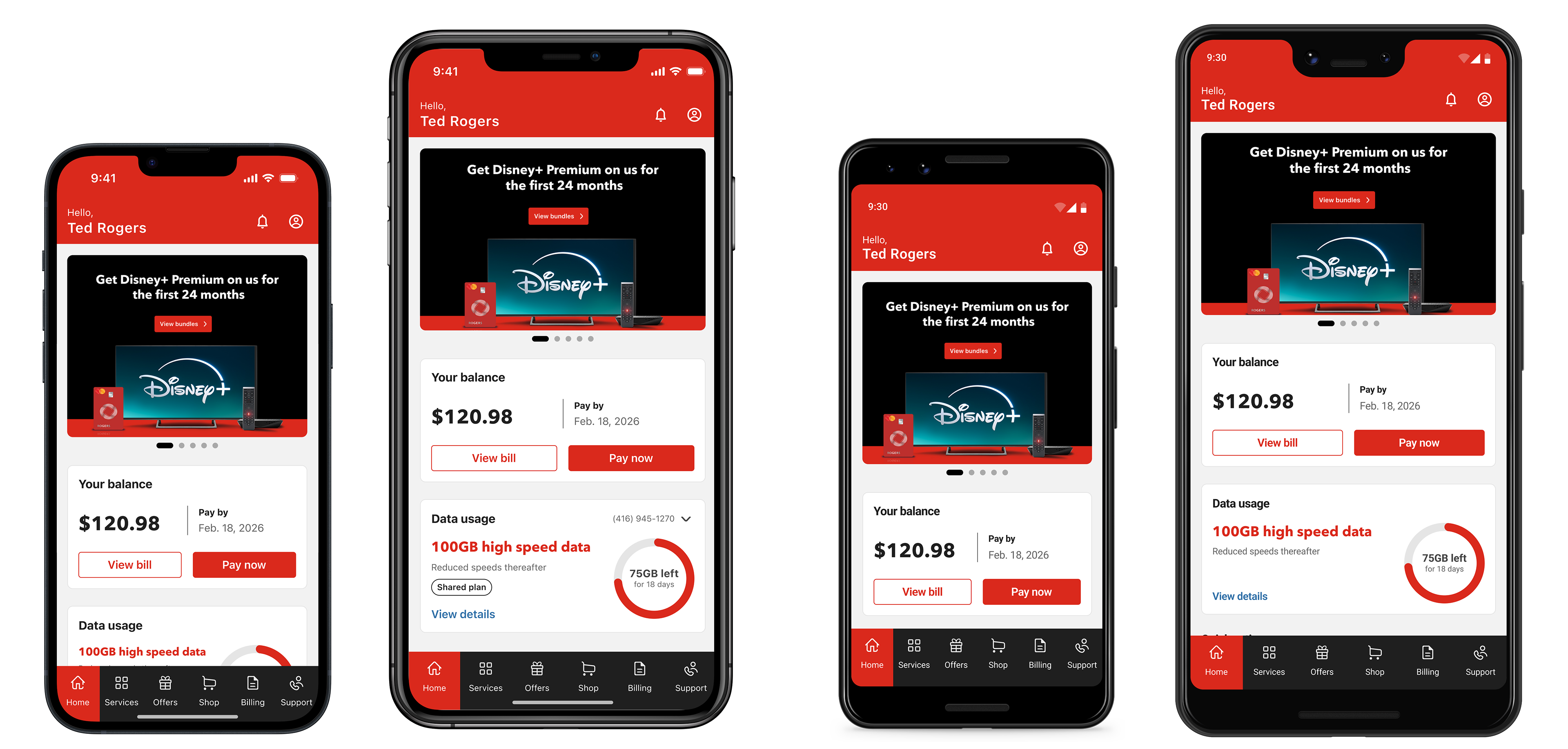
iOS Iphone 13 mini + Iphone 17 Pro Max | Google Pix 2 + Google Pix 3 XL
Folding devices
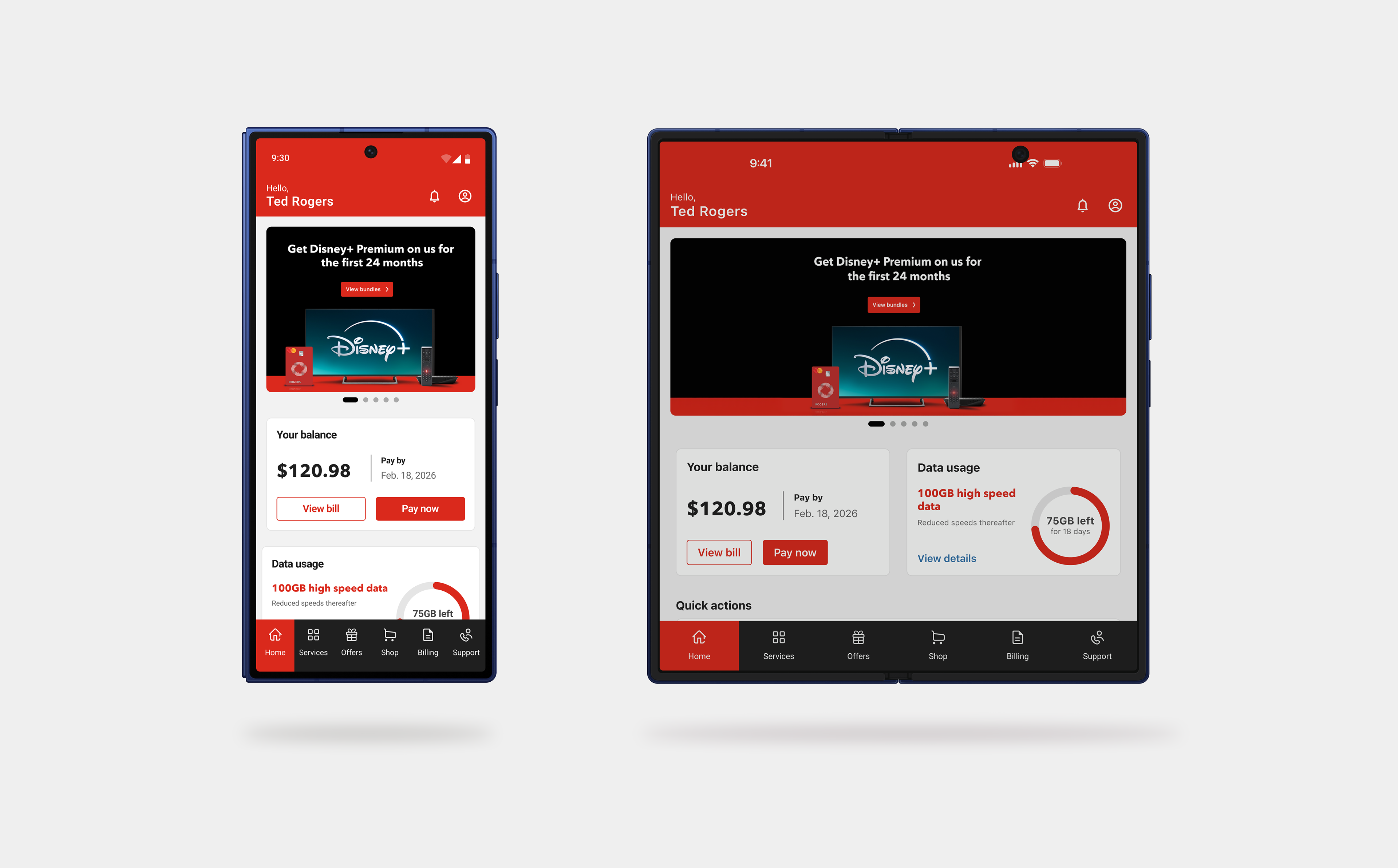
Mobile device with fold capability.
iPad & Tablet
Outcome
The introduction of the Home experience established a new entry point for the MyRogers mobile app, transforming it from a usage-focused tool into a broader service management platform.
The new architecture allows customers to access the most important aspects of their account from a single place, reducing the need to navigate across multiple sections of the app.
The Home experience enables customers to:
• View billing information and make payments
• Monitor data usage across their services
• Manage wireless, internet, and TV subscriptions
• Access account tools and support
• Discover device upgrades and service offers
• Monitor data usage across their services
• Manage wireless, internet, and TV subscriptions
• Access account tools and support
• Discover device upgrades and service offers
Beyond improving the immediate experience, the modular structure of the Home layout allows Rogers to introduce new services and features without redesigning the core entry point of the app.
This flexibility makes the Home experience a scalable foundation for future enhancements across the Rogers self-serve ecosystem.